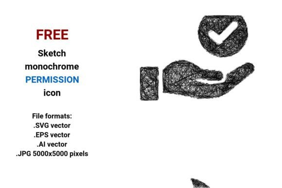
FREE Sketch Permission Icon
The FREE Sketch Permission Icon is a minimal, hand-drawn-style vector icon representing permission—commonly used to signal user consent, access control, or authorization in digital interfaces. It is delivered in four widely compatible file formats: .SVG, .EPS, .AI, and .JPG (5000×5000 pixels), all in black and white. As a vector image, it is mathematically defined—built from points, lines, and curves—ensuring crisp rendering at any scale without pixelation or quality loss.
Why Consider the FREE Sketch Permission Icon?
Designers, developers, and product teams often seek icons that balance clarity, scalability, and visual tone. The FREE Sketch Permission Icon appeals particularly when:
- You need a lightweight, expressive symbol for access permission or security contexts—such as onboarding flows, settings panels, or dashboard controls;
- Your design system emphasizes minimal sketch, handdrawn, or scribble-inspired aesthetics to convey approachability or creative intent;
- You require production-ready assets across multiple platforms—web, mobile, print, or documentation—without licensing fees or attribution requirements.
Its black-and-white palette supports high contrast, accessibility compliance, and easy recoloring via CSS or design tools. Because it’s provided in both vector (.SVG, .EPS, .AI) and high-resolution raster (.JPG) formats, it adapts to varied technical constraints—from scalable UI components to static illustrations in presentations or reports.
Benefits of This Permission Icon Set
Scalability and fidelity: As a true vector image, the FREE Sketch Permission Icon retains sharpness whether rendered at 16px in a toolbar or 2000px on a large display. This eliminates the need for multiple raster sizes and reduces asset management overhead.
Format flexibility: The inclusion of .SVG (ideal for web use with inline styling), .EPS and .AI (for professional editing in Adobe Illustrator or legacy workflows), and .JPG (for quick insertion into non-vector environments) lowers integration barriers across teams and tools.
Design cohesion: Its line-based, curve-focused construction aligns well with modern UI trends emphasizing subtle texture and human-centered cues. It functions as both a functional permission button or access permission icon and a conceptual pictogram—supporting both usability and narrative in dashboards, apps, or software documentation.
Tradeoffs and Practical Considerations
While versatile, this icon set has limitations worth acknowledging. Its sketch aesthetic—defined by uneven strokes and organic curves—may not suit highly formal, enterprise, or safety-critical interfaces where precision and standardization are prioritized (e.g., medical or financial software). In such cases, a cleaner, ISO-compliant permission icon or standardized security symbol may communicate more reliably.
Also, because it is monochrome, it does not encode meaning through color alone—a consideration for users relying on color cues for status (e.g., green = granted, red = denied). Designers must pair it with supporting text, labels, or interactive feedback to ensure clarity, especially in low-vision or color-deficient contexts.
Further, while the .JPG version offers high resolution, it is not transparent and cannot be layered over complex backgrounds without manual masking. For UI implementation, the .SVG remains the most adaptable format—especially when paired with CSS for dynamic coloring or responsive sizing.
When This Icon Is a Strong Fit
The FREE Sketch Permission Icon works best in scenarios where:
- A product’s visual language embraces creative concept, art, or design-oriented identity—such as prototyping tools, educational platforms, or creative SaaS applications;
- Development teams need lightweight, license-free assets for rapid iteration—particularly in early-stage UX work or internal dashboards;
- Icons appear in mixed-media layouts (e.g., alongside hand-drawn illustrations or annotated wireframes), where consistency in stroke weight and line quality matters more than strict geometric uniformity.
It also serves well as a mobile sketch icon or app element where screen real estate is limited but personality matters—such as permission prompts in lifestyle or productivity apps.
When to Explore Alternatives
Consider other options if your project requires:
- Strict accessibility conformance: Icons relying heavily on shape subtlety (e.g., fine curves or overlapping scribbles) may reduce legibility at small sizes or for users with low vision. A bolder, more abstract permission symbol with higher shape contrast may perform better.
- Multi-state interaction: If you need variants for enabled/disabled, granted/denied, or loading states, this set provides only one static representation. You’d need to adapt or extend it manually—or choose an icon library offering state-aware versions.
- Consistency across a full icon system: If your interface uses a cohesive set of UI icons with uniform stroke width, corner radius, and spacing, integrating a single sketch permission icon may disrupt visual rhythm unless others are similarly styled.
In those cases, open-source icon libraries (e.g., Heroicons, Phosphor, or Tabler Icons) or professionally curated sets with matching permission icons, access icons, and security icons may offer better long-term maintainability.
Making an Informed Choice
Evaluating the FREE Sketch Permission Icon comes down to alignment—not just with technical needs (format support, scalability), but with design philosophy and audience expectations. Ask yourself:
- Does its minimal sketch quality reinforce—or distract from—the message of trust and control implied by permission and access?
- Will developers integrate it efficiently using existing tooling (e.g., SVG sprites, Figma auto-layout, or React icon components)?
- Is there a clear path to test its effectiveness—through usability studies, A/B testing, or accessibility audits—before scaling it across products?
If your goals center on speed, expressiveness, and cost-free reuse—and your context tolerates stylistic variation—this icon delivers tangible value. If consistency, regulatory alignment, or multi-state behavior are primary, invest time comparing alternatives before committing.
Ultimately, the strongest icon choices emerge not from isolated features, but from how well they serve users’ understanding of access permission, support team workflows, and uphold broader UX and security goals.