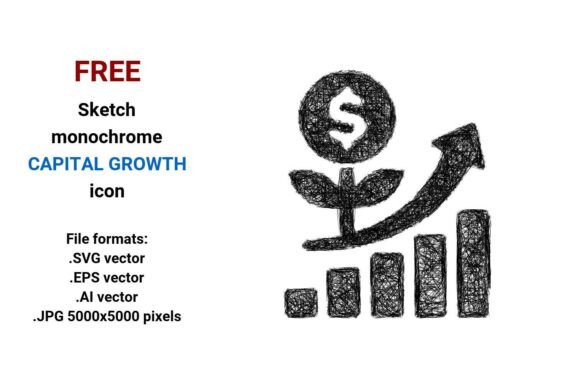
FREE Sketch Capital Growth Icon
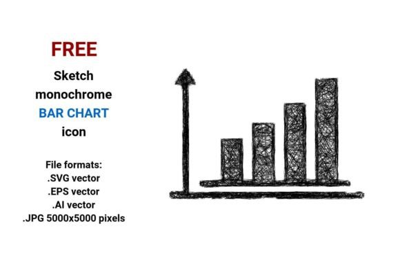
The FREE Sketch Capital Growth Icon is a downloadable set of monochrome, hand-drawn-style vector and raster assets designed to visually represent capital growth, asset growth, or financial progression. It includes four file formats: .SVG, .EPS, .AI, and a high-resolution .JPG (5000×5000 pixels). All versions share the same sketchy, minimal line-art aesthetic—evoking a pen-on-paper feel while maintaining clarity and scalability where appropriate.
What Makes This Icon Useful for Designers and Developers?
This icon serves as a visual shorthand for concepts like capital growth, asset growth, and broader finance or business growth themes. Its sketch style icon appearance supports creative, approachable, or educational contexts—such as fintech dashboards, investor education platforms, startup pitch decks, or financial literacy websites. Because it’s delivered in multiple formats, users can integrate it flexibly across tools and workflows.
The .SVG and .EPS files are vector images: mathematically defined shapes that scale infinitely without pixelation. That makes them ideal for responsive web interfaces, print materials, or UI components like buttons (capital growth button) or navigation symbols. The .AI version allows direct editing in Adobe Illustrator—useful if you need to adjust stroke weight, spacing, or layer structure. The .JPG provides a ready-to-use, high-fidelity raster option for static presentations or platforms that don’t support vector imports.
When Is the FREE Sketch Capital Growth Icon a Strong Fit?
This icon works well when your project values hand-drawn, minimal sketch icon aesthetics—especially in contexts prioritizing approachability over formality. For example:
- Educational or explanatory content—where a sketchy line icon helps soften complex topics like compound interest or portfolio expansion.
- Early-stage product interfaces—where a sketch vector icon signals iteration, creativity, or user-centered design.
- Printed reports or slide decks—where the 5000×5000 .JPG ensures crisp output at large sizes.
- Brands with a consistent sketch style icon system—allowing this asset to align with existing visual language around growth, capital, or finance.
Its monochrome sketch icon nature also supports accessibility: high contrast and uncluttered form improve legibility, especially when used as a web element or app symbol.
Tradeoffs and Practical Considerations
While versatile, the FREE Sketch Capital Growth Icon has limitations worth weighing before adoption:
- Style specificity: Its scribble-inflected, pen-outline look may clash with highly polished, corporate, or data-dense interfaces. In enterprise banking dashboards or regulatory filings, a cleaner, more literal line capital growth icon or branded custom icon might communicate more effectively.
- Format constraints: Though .SVG and .EPS scale infinitely, the .JPG does not. Using it at small sizes (e.g., 16×16px favicons) risks blurriness or loss of detail—so it shouldn’t serve as the sole source for tiny UI elements.
- Lack of color variants: Being strictly black-and-white, it doesn’t offer built-in color flexibility. You’ll need to recolor the vector files manually—or ensure your interface’s palette accommodates monochrome assets without sacrificing hierarchy or contrast.
- No licensing details provided: As a “free” download, its reuse terms (e.g., commercial use, attribution requirements, modification rights) aren’t specified in the naming or description. Always verify permissions before deploying in client work or public-facing products.
When Might Alternatives Be More Appropriate?
You may want to explore other options if:
- Your project requires color-coded growth states (e.g., green for positive, red for negative)—in which case a multi-color capital growth icons set would be more functional.
- You’re building a design system needing strict consistency across dozens of icons—then a unified flat, outline, or isometric library (with matching stroke weights and spacing) may reduce integration effort.
- Your audience includes users with low vision or cognitive differences—where abstract sketchy forms could hinder recognition. A more literal symbol (e.g., upward arrow + coin, stacked bars, or chart line) may improve comprehension.
- You need animated or interactive variants (e.g., hover effects, loading states)—which this static set doesn’t include.
Making a Practical Decision
To determine whether the FREE Sketch Capital Growth Icon aligns with your needs, ask:
- Does the sketch aesthetic match your brand voice and audience expectations? If your users expect authority and precision (e.g., institutional investors), lean toward more structured alternatives. If they respond well to warmth and experimentation (e.g., students, founders, creatives), this icon’s hand drawn quality may resonate.
- What formats do you actually need? If you only use Figma or web-based tools, .SVG is sufficient—and the .EPS or .AI files add little value. Conversely, if your team relies on Illustrator for production, the .AI file enables precise tweaks.
- How will it function in context? Test it at intended sizes: as a button, menu item, or chart label. Does the sketchy line icon remain legible next to text or other UI elements? Does it stand out enough—or fade into background noise?
- Is “free” truly cost-free? Factor in time spent verifying licensing, adjusting colors, converting formats, or redesigning if the icon proves unsuitable mid-project.
Ultimately, the FREE Sketch Capital Growth Icon is a practical, no-cost starting point—not a universal solution. Its strength lies in supporting intentional, human-centered design choices around capital growth, asset growth, and related finance concepts—provided those choices prioritize expressiveness and simplicity over rigid standardization.
Final Thought
If your goal is to quickly introduce a recognizable, scalable, and stylistically cohesive capital growth icon into a digital or printed project—and you value sketch vector icon authenticity over technical uniformity—the FREE Sketch Capital Growth Icon delivers tangible utility. Just remember to evaluate it against your specific functional, aesthetic, and operational requirements—not just its availability or format count.